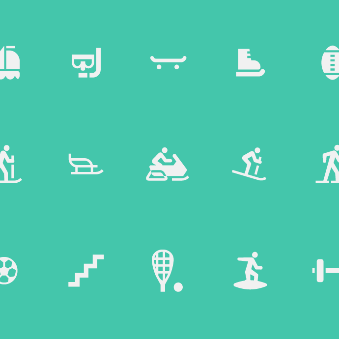
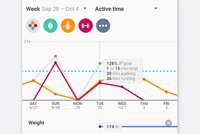
Working with the Google Fit and Google Play teams, we’ve designed hundreds of user interface icons currently in use across both platforms.
When viewed at their native 16x16 pixels, it's important that shapes follow the pixel grid, ensuring that they're as crisp as possible.
Google Play's slightly larger iconography allowed for more detailed shapes.